Foundation of Data Science: Unit III: Describing Relationships
Scatter Plots
Examples, Advantages, Disadvantage | Data Science
When two variables x and y have an association (or relationship), we say there exists a correlation between them.
Scatter Plots
• When
two variables x and y have an association (or relationship), we say there
exists a correlation between them.
Alternatively, we could say x and y are correlated. To find such an
association, we usually look at a scatterplot and try to find a pattern.
•
Scatterplot (or scatter diagram) is a graph in which the paired (x, y) sample
data are plotted with a horizontal x axis and a vertical y axis. Each
individual (x, y) pair is plotted as a single point.
• One
variable is called independent (X) and the second is called dependent (Y).
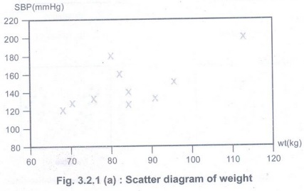
Example:
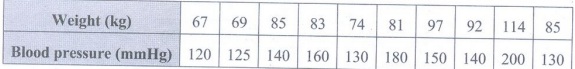
• Fig.
3.2.1 shows the scatter diagram.
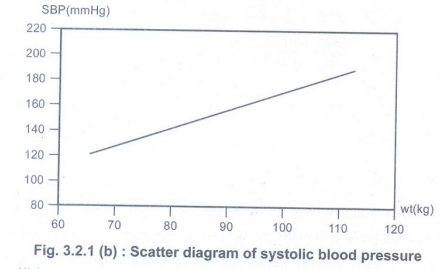

• The
pattern of data is indicative of the type of relationship between your two variables
:
1.
Positive relationship
2.
Negative relationship
3. No
relationship.
• The
scattergram can indicate a positive
relationship, a negative
relationship or a zero relationship.
Advantages of Scatter Diagram
1. It is
a simple to implement and attractive method to find out the nature of
correlation.
2. It is
easy to understand.
3. User
will get rough idea about correlation (positive or negative correlation).
4. Not
influenced by the size of extreme item
5. First
step in investing the relationship between two variables.
Disadvantage of scatter diagram
• Can
not adopt an exact degree of correlation.
Foundation of Data Science: Unit III: Describing Relationships : Tag: : Examples, Advantages, Disadvantage | Data Science - Scatter Plots
Foundation of Data Science: Unit III: Describing Relationships
Under Subject
Foundation of Data Science
CS3352 3rd Semester CSE Dept | 2021 Regulation | 3rd Semester CSE Dept 2021 Regulation
Related Subjects
Discrete Mathematics
MA3354 3rd Semester CSE Dept | 2021 Regulation | 3rd Semester CSE Dept 2021 Regulation
Digital Principles and Computer Organization
CS3351 3rd Semester CSE Dept | 2021 Regulation | 3rd Semester CSE Dept 2021 Regulation
Foundation of Data Science
CS3352 3rd Semester CSE Dept | 2021 Regulation | 3rd Semester CSE Dept 2021 Regulation
Data Structure
CS3301 3rd Semester CSE Dept | 2021 Regulation | 3rd Semester CSE Dept 2021 Regulation

Object Oriented Programming
CS3391 3rd Semester CSE Dept | 2021 Regulation | 3rd Semester CSE Dept 2021 Regulation