Foundation of Data Science: Unit V: Data Visualization
Visualizing Errors
Matplotlib | Data Visualization
Error bars are included in Matplotlib line plots and graphs. Error is the difference between the calculated value and actual value.
Visualizing Errors
• Error bars
are included in Matplotlib line plots and graphs. Error is the difference
between the calculated value and actual value.
• Without
error bars, bar graphs provide the perception that a measurable or determined
number is defined to a high level of efficiency. The method
matplotlib.pyplot.errorbar() draws y vs. x as planes and/or indicators with
error bars associated.
• Adding
the error bar in Matplotlib, Python. It's very simple, we just have to write
the value of the error. We use the command:
plt.errorbar(x, y, yerr = 2, capsize=3)
Where:
x = The
data of the X axis.
Y = The
data of the Y axis.
yerr =
The error value of the Y axis. Each point has its own error value.
xerr =
The error value of the X axis.
capsize
= The size of the lower and upper lines of the error bar
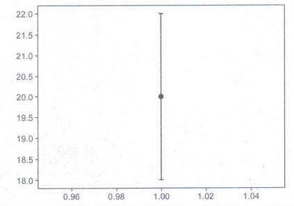
• A
simple example, where we only plot one point. The error is the 10% on the Y
axis.
importmatplotlib.pyplot
as plt
x = 1
y = 20
y_error
= 20*0.10 ## El 10% de error
plt.errorbar(x,y,
yerr = y_error, capsize=3)
plt.show()
Output:
• We
plot using the command "plt.errorbar (...)", giving it the desired
characteristics.
importmatplotlib.pyplot
as plt
importnumpy
as np
x =
np.arange(1,8)
y =
np.array([20,10,45,32,38,21,27])
y_error
= y * 0.10 ##El 10%
plt.errorbar(x,
y, yerr = y_error,
linestyle="None",
fmt="ob", capsize=3, ecolor="k")
plt.show()
• Parameters of the errorbar :
a) yerr
is the error value in each point.
b)
linestyle, here it indicate that we will not plot a line.
c) fmt,
is the type of marker, in this case is a point ("o") blue
("b").
d)
capsize, is the size of the lower and upper lines of the error bar.
e) ecolor, is the color of the error bar. The default color is the marker color.
Output:

•
Multiple lines in MatplotlibErrorbar in Python : The ability to draw numerous
lines in almost the same plot is critical. We'll draw many errorbars in the
same graph by using this scheme.
importnumpy
as np
importmatplotlib.pyplot
as plt
fig =
plt.figure()
x =
np.arange(20)
y = 4*
np.sin(x / 20 * np.pi)
yerr =
np.linspace (0.06, 0.3, 20)
plt.errorbar(x,
y + 8, yerr = yerr, )
plt.errorbar(x,
y + 6, yerr = yerr,
uplims =
True, )
plt.errorbar(x,
y + 4, yerr = yerr,
uplims =
True,
lolims
True, )
upperlimits
= [True, False] * 6
lowerlimits
= [False, True]* 6
plt.errorbar(x,
y, yerr = yerr,
uplims =upperlimits,
lolims =
lowerlimits, )
plt.legend(loc='upper
left')
plt.title('Example')
plt.show()
Output:

Foundation of Data Science: Unit V: Data Visualization : Tag: : Matplotlib | Data Visualization - Visualizing Errors
Related Topics
Related Subjects

Foundation of Data Science
CS3352 3rd Semester CSE Dept | 2021 Regulation | 3rd Semester CSE Dept 2021 Regulation