Foundation of Data Science: Unit V: Data Visualization
Scatter Plots
Matplotlib | Data Visualization
A scatter plot is a visual representation of how two variables relate to each other.
Scatter Plots
• A
scatter plot is a visual representation of how two variables relate to each
other. we can use scatter plots to explore the relationship between two
variables, for example by looking for any correlation between them.
• Matplotlib
also supports more advanced plots, such as scatter plots. In this case, the
scatter function is used to display data values as a collection of x, y
coordinates represented by standalone dots.
importmatplotlib.pyplot
as plt
#X axis
values:
x =
[2,3,7,29,8,5,13,11,22,33]
# Y axis
values:
y =
[4,7,55,43,2,4,11,22,33,44]
# Create
scatter plot:
plt.scatter(x,
y)
plt.show()
• Comparing plt.scatter() and plt.plot(): We can
also produce the scatter plot shown above using another function within
matplotlib.pyplot. Matplotlib'splt.plot() is a general-purpose plotting
function that will allow user to create various different line or marker plots.
• We can
achieve the same scatter plot as the one obtained in the section above with the
following call to plt.plot(), using the same data:
plt.plot(x,
y, "o")
plt.show()
• In
this case, we had to include the marker "o" as a third argument, as
otherwise plt.plot() would plot a line graph. The plot created with this code
is identical to the plot created earlier with plt.scatter().
. • Here's
a rule of thumb that can use :
a) If we
need a basic scatter plot, use plt.plot(), especially if we want to prioritize
performance.
b) If we
want to customize our scatter plot by using more advanced plotting features,
use plt.scatter().
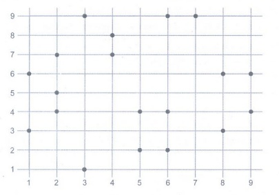
• Example: We can create a simple
scatter plot in Python by passing x and y values to plt.scatter():
#
scatter_plotting.py
importmatplotlib.pyplot
as plt
plt.style.use('fivethirtyeight')
x = [2,
4, 6, 6, 9, 2, 7, 2, 6, 1, 8, 4, 5, 9, 1, 2, 3, 7, 5, 8, 1, 3]
y = [7,
8, 2, 4, 6, 4, 9, 5, 9, 3, 6, 7, 2, 4, 6, 7, 1, 9, 4, 3, 6, 9]
plt.scatter(x,
y)
plt.show()
Output:
Creating Advanced Scatterplots
• Scatterplots
are especially important for data science because they can show data patterns
that aren't obvious when viewed in other ways.
import
matplotlib.pyplot as plt
x_axis1 =[1,
2, 3, 4, 5, 6, 7, 8, 9, 10]
y_axis1 =[5,
16, 34, 56, 32, 56, 32, 12, 76, 89]
x_axis2
= [1, 2, 3, 4, 5, 6, 7, 8, 9, 10]
y_axis2
= [53, 6, 46, 36, 15, 64, 73, 25, 82, 9]
plt.title("Prices
over 10 years")
plt.scatter(x_axis1,
y_axis1, color = 'darkblue', marker='x', label="item 1")
plt.scatter(x_axis2,
y_axis2, color='darkred', marker='x', label="item 2")
plt.xlabel("Time
(years)")
plt.ylabel("Price
(dollars)")
plt.grid(True)
plt.legend()
plt.show()
• The
chart displays two data sets. We distinguish between them by the colour of the
marker.
Foundation of Data Science: Unit V: Data Visualization : Tag: : Matplotlib | Data Visualization - Scatter Plots
Related Topics
Related Subjects
Foundation of Data Science
CS3352 3rd Semester CSE Dept | 2021 Regulation | 3rd Semester CSE Dept 2021 Regulation