Object Oriented Programming: Unit V: JAVAFX Event Handling, Controls and Components
JAVAFX Controls
Syntax with Example Java Programs
The graphical User Interface (GUI) is an essential part of any window based application.The interaction between user and the application program is possible with the help of User Interface (UI) controls that are placed on the screen.
Controls
• The graphical User Interface (GUI) is an essential part of any window based application.
• The interaction between user and the application program is possible with the help of User Interface (UI) controls that are placed on the screen.
• JavaFX allows its developer a rich set of UI controls. Some of the most commonly used UI Controls are enlisted in the following table.

Let us now learn and understand how to create simple JavaFX programs that use these UI controls.
Label
• The label control displays simple text on the screen.
• Its main purpose is to describe other components such as textfield, textarea, radio button and so on.
• For using this control the package javafx.scene.control.Label need to be imported.
• The constructors used for using Label control is
Label(): This creates an empty label.
Label(String txt): This creates a label with supplied text.
Label(String txt, Node graphics) : It creates a label with supplied text and graphics.
• Programming Example
package MyJavaFXApplication;
import javafx.application.Application;
import static javafx.application.Application.launch;
import javafx.event.ActionEvent;
import javafx.event.EventHandler;
import javafx.scene.Scene;
import javafx.scene.layout.StackPane;
import javafx.scene.control.Label;
import javafx.scene.layout.StackPane;
import javafx.stage.Stage;
public class MyJavaFXApplication extends Application {
@Override
public void start (Stage primaryStage)
{
StackPane root=new StackPane();
Label L=new Label("User Name");
Scene scene = new Scene(root, 250, 250);
root.getChildren().add(L);
primaryStage.setTitle("Label Demo");
primaryStage.setScene(scene);
primaryStage.show();
}
public static void main(String[] args) {
launch(args);
}
}
Output

Program Explanation: In above program,
(1) We have created StackPane so that the Label control can be arranged on top just like a stack. The stackPane is a used to decide the layout of the screen. This is named as root node.
(2) Then we have created one label "User Name" using the Label constructor.
(3) These controls must be contained in a scene. Hence a scene is prepared by adding a root node using Scene constructor. This scene is then attached to a primaryStage using setScene method.
(4) Then using show() method we display the primaryStage. This ultimately displays the label control.
Button
• The button control is the most commonly used control in any GUI application. This UI component controls the behavior of the application. Some event gets generated when a button is clicked.
• The button control is created using following code
Button btn=new Button("Click Here");
• For using the button control we need to import the package javafx.scene.control.Button. Following program shows the creation of button control in JavaFX
Programming Example
package MyJavaFXApplication;
import java.io.FileInputStream;
import javafx.application. Application;
import static javafx.application. Application.launch;
import javafx.event.ActionEvent;
import javafx.event.EventHandler;
import javafx.scene.Scene;
import javafx.scene.layout.StackPane;
import javafx.scene.control.Button;
import javafx.scene.layout.StackPane;
import javafx.stage.Stage;
public class MyJavaFXApplication extends Application {
@Override
public void start (Stage primaryStage) throws Exception {
StackPane root=new StackPane();
Button B=new Button("Click Me");
Scene scene = new Scene(root, 200, 250);
root.getChildren().add(B);
primaryStage.setTitle("Button Demo");
primaryStage.setScene(scene);
primaryStage.show();
}
public static void main(String[] args) {
launch(args);
}
}
Output

Checkbox
Checkbox is used to provide more than one choices at a time.
For using checkbox in our application program, we must insert following line in the program
at the beginning -
import javafx.scene.control.Checkbox
The checkbox can be created using following statement
CheckBox ch=new CheckBox("Label Name");
The checkbox is selected true by using the method, setSelected("true")
Following program shows how to create checkbox.
Programming Example
package MyJavaFXApplication;
import java.io.FileInputStream;
import javafx.application. Application;
import static javafx.application.Application.launch;
import javafx.event.ActionEvent;
import javafx.event.EventHandler;
import javafx.scene.Scene;
import javafx.scene.control.Label;
import javafx.scene.control.CheckBox;
import javafx.scene.layout.HBox;
import javafx.stage.Stage;
public class MyJavaFXApplication extends Application {
@Override
public void start (Stage primaryStage)throws Exception {
HBox root = new HBox();
Label L=new Label("Select your favorite color: ");
CheckBox ch1=new CheckBox("Red");
CheckBox ch2=new CheckBox("Blue");
CheckBox ch3=new CheckBox("Green");
CheckBox ch4=new CheckBox("Yellow");
Scene scene = new Scene(root, 400, 100);
root.getChildren().addAll(L, ch1,ch2,ch3,ch4);
primaryStage.setTitle("Checkbox Demo");
primaryStage.setScene(scene);
primaryStage.show();
}
public static void main(String[] args) {
launch(args);
}
}
Output

ToggleButton
• ToggleButton is a button control that has two states selected or deselected.
• The ToggleButtons are placed in a Toggle Group. From the same group at the most only one button is selected at a time. If one button is selected from that group then other buttons of that group remain deselected.
• Constructors
1. ToggleButton(): Creates a toggle button with an empty string for its label.
2. ToggleButton(String txt): Creates a toggle button with the specified text as its label.
Methods
1. setToggleGroup(ToggleGroup val):Sets the value of the property toggleGroup.
2. setSelected(boolean val): Sets the value of the property selected.
3. isSelected(): Gets the value of the property selected.
Example Program
package application;
import javafx.application.Application;
import javafx.scene.Scene;
import javafx.scene.layout.HBox;
import javafx.geometry.Insets;
import javafx.scene.control.Label;
import javafx.scene.control. ToggleButton;
import javafx.scene.control.ToggleGroup;
import javafx.stage.Stage;
public class Main extends Application {
@Override
public void start(Stage primaryStage)throws Exception {
HBox root=new HBox();
root.setPadding(new Insets(15));
root.setSpacing(10);
root.getChildren().add(new Label("I Like:"));
// Creating a ToggleGroup
ToggleGroup group = new ToggleGroup();
// Creating new Toggle buttons
ToggleButton blueButton = new ToggleButton("Blue");
ToggleButton blackButton = new ToggleButton("Black");
// Set toggle group
blueButton.setToggle Group (group);
blackButton.setToggleGroup(group);
blueButton.setSelected(true);
root.getChildren().addAll(blueButton, blackButton);
Scene scene = new Scene(root, 300, 300);
primaryStage.setTitle("ToggleButton Demo");
primaryStage.setScene(scene);
primaryStage.show();
}
public static void main(String[] args) {
launch(args);
}
}
Output


RadioButtons
The Radio button control is used to make a choice.
The difference between checkbox and radio button is that with checkbox we can have more than one selection but with radio button we select only one option at a time.
We can create a radiobutton as follows-
RadioButton radioButton1 = new RadioButton("Label1");
We can group JavaFX RadioButton instances into a ToggleGroup. A ToggleGroup allows at most one RadioButton to be selected at any time.
Following example shows how to create and use the radio button control.
Programming Example
package MyJavaFXApplication;
import java.io.FileInputStream;
import javafx.application.Application;
import static javafx.application. Application.launch;
import javafx.event.ActionEvent;
import javafx.event.EventHandler;
import javafx.scene.Scene;
import javafx.scene.control.Label;
import javafx.scene.control.RadioButton;
import javafx.scene.control. ToggleGroup;
import javafx.scene.layout.VBox;
import javafx.stage.Stage;
public class MyJavaFXApplication extends Application {
@Override
public void start(Stage primaryStage) throws Exception {
ToggleGroup group=new ToggleGroup();
Label L=new Label("Select your favorite color: ");
RadioButton rb1=new RadioButton("Red");
RadioButton rb2=new RadioButton("Blue");
RadioButton rb3=new RadioButton("Green");
RadioButton rb4=new RadioButton("Yellow");
rb1.setToggleGroup(group);
rb2.setToggleGroup(group);
rb3.setToggleGroup(group);
rb4.setToggleGroup(group);
VBox root=new VBox();
Scene scene = new Scene(root, 300, 200);
root.getChildren().addAll(L,rb1,rb2,rb3,rb4);
primaryStage.setTitle("RadioButton Demo");
primaryStage.setScene(scene);
primaryStage.show();
}
public static void main(String[] args) {
launch(args);
}
}
Output

Textfield
TextField control allows the user to enter the text that can be read by the application.
The package javafx.scene.control.TextField need to be imported for using the TextField control.
Programming Example
package MyJavaFXApplication;
import java.io.FileInputStream;
import javafx.application. Application;
import static javafx.application. Application.launch;
import javafx.event.ActionEvent;
import javafx.event.EventHandler;
import javafx.scene.Scene;
import javafx.scene.control.Label;
import javafx.scene.control.TextField;
import javafx.scene.layout.GridPane;
import javafx.scene.layout.VBox;
import javafx.stage.Stage;
public class MyJavaFXApplication extends Application {
@Override
public void start(Stage primaryStage)throws Exception {
Label L=new Label("Enter Name ");
TextField tf=new TextField();
GridPane root=new GridPane();
root.addRow(0,L,tf);
Scene scene = new Scene(root, 300, 200);
primaryStage.setTitle("Text Field Demo");
primaryStage.setScene(scene);
primaryStage.show();
}
public static void main(String[] args) {
launch(args);
}
}
Output

Ex. 5.4.1: Write a JavaFX application for creating a login form.
Sol.:
package MyJavaFXApplication;
import java.io.FileInputStream;
import javafx.application. Application;
import static javafx.application. Application.launch;
import javafx.event.ActionEvent;
import javafx.event.EventHandler;
import javafx.scene.Scene;
import javafx.scene.control.Button;
import javafx.scene.control.Label;
import javafx.scene.control.PasswordField;
import javafx.scene.control.TextField;
import javafx.scene.layout.GridPane;
import javafx.stage.Stage;
public class MyJavaFXApplication extends Application {
@Override
public void start(Stage primaryStage)throws Exception { Label
L1=new Label("Enter Name ");
TextField tf1-new TextField();
Label L2=new Label("Enter Password ");
TextField tf2 new PasswordField();
Button btn=new Button("Submit");
GridPane root=new GridPane();
root.setVgap(10);
root.addRow(0, L1,tf1)
root.addRow(1, L2,tf2)
root.addRow(2,btn);
Scene scene = new Scene(root, 300, 200);
primaryStage.setTitle("Text Field Demo");
primaryStage.setScene(scene);
primaryStage.show();
}
public static void main(String[] args) {
launch(args);
}
}
Output

TextArea
The TextArea control allows to enter multiline text. This control is represented by the class javafx.scene.control.TextArea
The textarea control can be created using
TextArea ta= new TextArea()
We can set the size of the TextArea using setPrefHeight() and setPrefWidth() functions.
Following example shows how to create TextArea control
Programming Example
package My JavaFXApplication;
import java.io.FileInputStream;
import javafx.application.Application;
import static javafx.application. Application.launch;
import javafx.event.ActionEvent;
import javafx.event.EventHandler;
import javafx.scene.Scene;
import javafx.scene.control.Label;
import javafx.scene.control.TextArea;
import javafx.scene.layout.GridPane;
import javafx.stage.Stage;
public class MyJavaFXApplication extends Application {
@Override
public void start (Stage primaryStage) throws Exception {
Label L=new Label("Enter your Comments: ");
TextArea ta= new TextArea();
double height=100;
double width=150;
ta.setPrefHeight(height);
ta.setPrefWidth(width);
GridPane root=new GridPane();
root.addRow(0,L,ta);
Scene scene = new Scene(root, 300, 200);
primaryStage.setTitle("Text Area Demo");
primaryStage.setScene(scene);
primaryStage.show();
}
public static void main(String[] args) {
launch(args);
}
}
Output

ListView
The JavaFX ListView control enables users to choose one or more options from a predefined list of choices. The JavaFX ListView control is represented by the class javafx.scene.control.ListView.
The ListView can be created as follows -
ListView listView = new ListView()
The items can be added to the ListView control using getItems().add() method. For example
listView.getItems().add("Item 1");
listView.getItems().add("Item 2");
……..
To make a ListView visible we have to add it to the scene graph or to some layout component which is then attached to the Scene object.
Following example program shows how to use ListView Control
Programming Example
package MyJavaFXApplication;
import javafx.application. Application;
import static javafx.application.Application.launch;
import javafx.event.ActionEvent;
import javafx.event.EventHandler;
import javafx.scene.Scene;
import javafx.scene.control.Label;
import javafx.scene.control.ListView;
import javafx.scene.control.SelectionMode;
import javafx.scene.layout.GridPane;
import javafx.stage.Stage;
public class MyJavaFXApplication extends Application {
@Override
public void start (Stage primaryStage)throws Exception {
Label L=new Label("Select your favorite programming Language: ");
ListView listView = new ListView();
listView.getSelectionModel().setSelectionMode(SelectionMode.MULTIPLE);
listView.getItems().add("Java");
listView.getItems().add("C++");
listView.getItems().add("PHP");
listView.getItems().add("Python");
GridPane root=new GridPane();
root.addRow(0,L,listView)
Scene scene = new Scene(root, 350, 200);
primaryStage.setTitle("ListView Demo");
primaryStage.setScene(scene);
primaryStage.show();
}
public static void main(String[] args) {
launch(args);
}
}
Output

In above code we have used
listView.getSelectionModel().setSelectionMode(SelectionMode.MULTIPLE);
which allows multiple selection of items from listview.
ComboBox
We can have predefined list of choices using combo box.
This control is represented by javafx.scene.control.ComboBox class. Hence we need to import it at the beginning of our application program.
We can create the comboBox using following statement
ComboBox cb=new ComboBox();
Then we need to add the list of choices to the comboBox. This can be done using
cb.getItems().add("Option1")
cb.getItems().add("Option2")
…………..
And so on.
Following program illustrates the use of ComboBox control in the JavaFX application program.
Programming Example
package MyJavaFXApplication;
import java.io.FileInputStream;
import javafx.application. Application;
import static javafx.application.Application.launch;
import javafx.event.ActionEvent;
import javafx.event.EventHandler;
import javafx.scene.Scene;
import javafx.scene.control.ComboBox;
import javafx.scene.control.Label;
import javafx.scene.layout. GridPane;
import javafx.stage.Stage;
public class MyJavaFXApplication extends Application {
@Override
public void start (Stage primaryStage) throws Exception {
Label L=new Label("Select your favorite programming Language: ");
ComboBox cb=new ComboBox();
cb.getItems().add("Java");
cb.getItems().add("C++");
cb.getItems().add("PHP");
cb.getItems().add("Python");
GridPane root = new GridPane();
root.addRow(0,L,cb);
Scene scene = new Scene(root, 350, 200);
primaryStage.setTitle("ComboBox Demo");
primaryStage.setScene(scene);
primaryStage.show();
}
public static void main(String[] args) {
launch(args);
}
}
Output

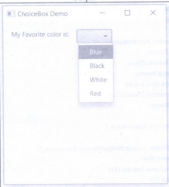
ChoiceBox
• The ChoiceBox control shows the set of items and allows user to select a single choice. It will show the currently selected item on the top.
• By default the ChoiceBox control has no selected item. We have to specify the items from which the choice is to be made.
• For using the ChoiceBox control we need to import javafx.scene.control.ChoiceBox package
• Constructors of ChoiceBox Class are
ChoiceBox(): It creates empty ChoiceBox
ChoiceBox(ObservableList items): It creates empty ChoiceBox with the given set of items.
Commonly Use Methods are

Programming Example
package application;
import javafx.application.Application;
import javafx.scene.Scene;
import javafx.scene.layout.HBox;
import javafx.geometry.Insets;
import javafx.scene.control.Label;
import javafx.scene.control.ChoiceBox;
import javafx.stage.Stage;
public class Main extends Application {
@Override
public void start (Stage primaryStage) throws Exception {
HBox root=new HBox();
root.setPadding(new Insets(15));
root.setSpacing(10);
// Creating a Label
root.getChildren().add(new Label("My Favorite color is: "));
// Creating a ChoiceBox
ChoiceBox<Object> choiceBox = new ChoiceBox<Object>();
choiceBox.getItems().add("Blue");
choiceBox.getItems().add("Black");
choiceBox.getItems().add("White");
choiceBox.getItems().add("Red");
root.getChildren().add(choiceBox);
Scene scene = new Scene(root, 300, 300);
primaryStage.setTitle("ChoiceBox Demo");
primaryStage.setScene(scene);
primaryStage.show();
}
public static void main(String[] args) {
launch(args);
}
}
Output
Scrollbar
Using the Scrollbar control the user can scroll down to the application page.
For creating this control we use javafx.scene.control.ScrollBar class.
Programming Example
package MyJavaFXApplication;
import javafx.application. Application;
import static javafx.application. Application.launch;
import javafx.scene.Scene;
import javafx.scene.control.Label;
import javafx.scene.control.ScrollBar;
import javafx.scene.layout.StackPane;
import javafx.stage.Stage;
public class MyJavaFXApplication extends Application {
@Override
public void start (Stage primaryStage) throws Exception {
ScrollBar sb=new ScrollBar();
StackPane root=new StackPane();
root.getChildren().add(sb);
Copbolwonhot te
}
Scene scene = new Scene(root, 350, 200);
primaryStage.setTitle("ScrollBar Demo");
primaryStage.setScene(scene);
primaryStage.show();
}
public static void main(String[] args) {
launch(args);
}
}
Output

We can create the scrollbar in horizontal direction or in vertical direction. If we want the scrollbar to be displayed vertically then we call setOrientation() method
sb.setOrientation (Orientation. VERTICAL);
Similarly we can set minimum, maximum or current value to scrollbar using following functions
(1) setMin()
(2) setMax()
(3) setValue()
Following program makes use of these methods for the scrollbar control
package MyJavaFXApplication;
import javafx.application. Application;
import static javafx.application.Application.launch;
import javafx.geometry.Orientation;
import javafx.scene.Scene;
import javafx.scene.control.Label;
import javafx.scene.control.ScrollBar;
import javafx.scene.layout.StackPane;
import javafx.stage.Stage;
public class MyJavaFXApplication extends Application {
@Override
public void start(Stage primaryStage) throws Exception {
ScrollBar sb=new ScrollBar();
sb.setMin(0);
sb.setMax(50);
sb.setValue(25);
sb.setOrientation (Orientation. VERTICAL);
StackPane root = new StackPane();
root.getChildren().add(sb);
Scene scene = new Scene(root, 350, 200);
primaryStage.setTitle("ScrollBar Demo");
primaryStage.setScene(scene);
primaryStage.show();
}
public static void main(String[] args) {
launch(args);
}
}
Output

Object Oriented Programming: Unit V: JAVAFX Event Handling, Controls and Components : Tag: : Syntax with Example Java Programs - JAVAFX Controls
Related Topics
Related Subjects
Object Oriented Programming
CS3391 3rd Semester CSE Dept | 2021 Regulation | 3rd Semester CSE Dept 2021 Regulation