Foundation of Data Science: Unit V: Data Visualization
Importing Matplotlib
Data Visualization
Matplotlib is a cross-platform, data visualization and graphical plotting library for Python and its numerical extension NumPy.
UNIT V: Data Visualization
Syllabus
Importing
Matplotlib - Line plots - Scatter plots - visualizing errors - density and
contour plots Histograms - legends - colors - subplots - text and annotation -
customization three dimensional plotting - Geographic Data with Basemap -
Visualization with Seaborn.
Importing Matplotlib
• Matplotlib
is a cross-platform, data visualization and graphical plotting library for
Python and its numerical extension NumPy.
•
Matplotlib is a comprehensive library for creating static, animated, and
interactive visualizations in Python.
• Matplotlib
is a plotting library for the Python programming language. It allows to make
quality charts in few lines of code. Most of the other python plotting library
are build on top of Matplotlib.
• The
library is currently limited to 2D output, but it still provides you with the
means to express graphically the data patterns.
Visualizing Information: Starting with Graph
• Data
visualization is the presentation of quantitative information in a graphical
form. In other words, data visualizations turn large and small datasets into
visuals that are easier for the human brain to understand and process.
• Good
data visualizations are created when communication, data science, and design
collide. Data visualizations done right offer key insights into complicated
datasets in ways that are meaningful and intuitive.
• A
graph is simply a visual representation of numeric data. MatPlotLib supports a
large number of graph and chart types.
•
Matplotlib is a popular Python package used to build plots. Matplotlib can also
be used to make 3D plots and animations.
• Line
plots can be created in Python with Matplotlib's pyplot library. To build a
line plot, first import Matplotlib. It is a standard convention to import
Matplotlib's pyplot library as plt.
• To
define a plot, you need some values, the matplotlib.pyplot module, and an idea
of what you want to display.
import
matplotlib.pyplot as plt
plt.plot([1,2,3],[5,7,4])
plt.show()
• The
plt.plot will "draw" this plot in the background, but we need to
bring it to the screen when we're ready, after graphing everything we intend
to.
• plt.show():
With that, the graph should pop up. If not, sometimes can pop under, or you may
have gotten an error. Your graph should look like :
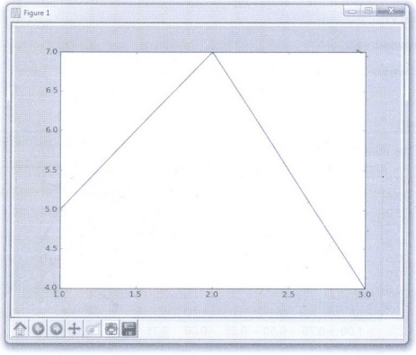
• This
window is a matplotlib window, which allows us to see our graph, as well as
interact with it and navigate it
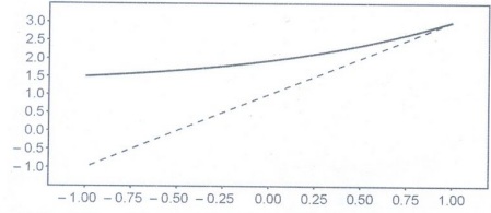
Line Plot
• More
than one line can be in the plot. To add another line, just call the plot (x,y)
function again. In the example below we have two different values for y (y1, y2)
that are plotted onto the chart.
import
matplotlib.pyplot as plt
import
numpy as np
x =
np.linspace(-1, 1, 50)
y1 =
2*x+ 1
y2 =
2**x + 1
plt.figure(num
= 3, figsize=(8, 5))
plt.plot(x,
y2)
plt.plot(x,
y1,
linewidth=1.0,
linestyle='--'
)
plt.show()
• Output
of the above code will look like this:
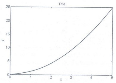
Example 5.1.1: Write a simple python program
that draws a line graph where x = [1,2,3,4] and y = [1,4,9,16] and gives both
axis label as "X-axis" and "Y-axis".
Solution:
importmatplotlib.pyplot
as plt
importnumpy
as np
# define
data values
x =
np.array([1, 2, 3, 4]) # X-axis points
y = x*2
# Y-axis points
print("Values
of :")
print("Values
of Y):")
print
(Y)
plt.plot(X,
Y)
# Set
the x axis label of the current axis.
plt.xlabel('x-axis')
# Set
the y axis label of the current axis.
plt.ylabel('y-axis')
# Set a
title
plt.title('Draw
a line.')
#
Display the figure.
plt.show()
Saving Work to Disk
• Matplotlib
plots can be saved as image files using the plt.savefig() function.
• The
.savefig() method requires a filename be specified as the first argument. This
filename can be a full path. It can also include a particular file extension if
desired. If no extension is provided, the configuration value of savefig.format
is used instead.
• The
.savefig() also has a number of useful optional arguments :
1. dpi
can be used to set the resolution of the file to a numeric value.
2.
transparent can be set to True, which causes the background of the chart to be
transparent.
3.
bbox_inches can be set to alter the size of the bounding box (whitespace)
around the output image. In most cases, if no bounding box is desired, using
bbox_inches = 'tight' is ideal.
4. If
bbox_inches is set to 'tight', then the pad_inches option specifies the amount
of padding around the image.
Setting the Axis, Ticks, Grids
• The
axes define the x and y plane of the graphic. The x axis runs horizontally, and
the y axis runs vertically.
• An
axis is added to a plot layer. Axis can be thought of as sets of x and y axis
that lines and bars are drawn on. An Axis contains daughter attributes like
axis labels, tick labels, and line
thickness.
• The
following code shows how to obtain access to the axes for a plot :
fig =
plt.figure()
axes =
fig.add_axes([0.1, 0.1, 0.8, 0.8]) #
left, bottom, width, height (range 0 to 1)
axes.plot(x,
y, 'r')
axes.set_xlabel('x')
axes.set_ylabel('y')
axes.set_title('title');
Output:
• A grid
can be added to a Matplotlib plot using the plt.grid() command. By defaut, the
grid is turned off. To turn on the grid use:
plt.grid(True)
• The
only valid options are plt.grid(True) and plt.grid(False). Note that True and
False are capitalized and are not enclosed in quotes.
Defining the Line Appearance and Working with Line Style
• Line
styles help differentiate graphs by drawing the lines in various ways.
Following line style is used by Matplotlib.
• Matplotlib
has an additional parameter to control the colour and style of the plot.
plt.plot(xa, ya 'g')

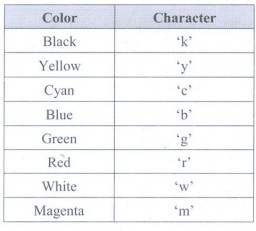
• This
will make the line green. You can use any colour of red, green, blue, cyan,
magenta, yellow, white or black just by using the first character of the colour
name in lower case (use "k" for black, as "b" means blue).
• You
can also alter the linestyle, for example two dashes -- makes a dashed line.
This can be used added to the colour selector, like this:
plt.plot(xa, ya 'r--')
• You
can use "-" for a solid line (the default), "-." for
dash-dot lines, or ":" for a dotted line. Here is an example :
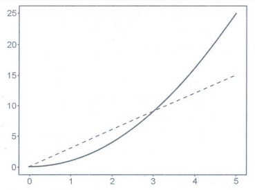
from
matplotlib import pyplot as plt
import
numpy as np
xa =
np.linspace(0, 5, 20)
ya =
xa**2
plt.plot(xa,
ya, 'g')
ya =
3*xa
plt.plot(xa,
ya, 'r--')
plt.show()
Output:
•
MatPlotLib Colors are as follows:
Adding Markers
•
Markers add a special symbol to each data point in a line graph. Unlike line
style and color, markers tend to be a little less susceptible to accessibility
and printing issues.
• Basically,
the matplotlib tries to have identifiers for the markers which look similar to
the marker:
1.
Triangle-shaped: v, <, > Λ
2.
Cross-like: *,+, 1, 2, 3, 4
3.
Circle-like: 0,., h, p, H, 8
• Having
differently shaped markers is a great way to distinguish between different groups
of data points. If your control group is all circles and your experimental
group is all X's the difference pops out, even to colorblind viewers.
N =
x.size // 3
ax.scatter(x[:N],
y[:N], marker="o")
ax.scatter(x[N:
2* N], y[N: 2* N], marker="x")
ax.scatter(x[2*
N:], y[2 * N:], marker="s")
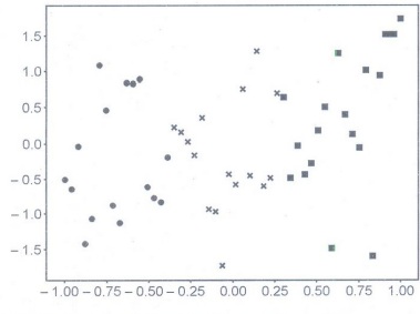
• There's
no way to specify multiple marker styles in a single scatter() call, but we can
separate our data out into groups and plot each marker style separately. Here
we chopped our data up into three equal groups.
Using Labels, Annotations and Legends
• To
fully document your graph, you usually have to resort to labels, annotations,
and legends. Each of these elements has a different purpose, as follows:
1. Label: Make it easy for the viewer
to know the name or kind of data illustrated
2. Annotation: Help
extend the viewer's knowledge of the data, rather than simply identify it.
3. Legend: Provides cues to make
identification of the data group easier.
• The
following example shows how to add labels to your graph:
values = [1, 5, 8, 9, 2, 0, 3, 10, 4, 7]
import matplotlib.pyplot as plt
plt.xlabel('Entries')
plt.ylabel('Values')
plt.plot(range(1,11), values)
plt.show()
• Following
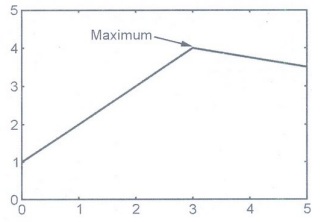
example shows how to add annotation to a graph:
import matplotlib.pyplot as plt
W = 4
h = 3
d = 70
plt.figure(figsize=(w, h), dpi=d)
plt.axis([0, 5, 0, 5])
x = [0, 3, 5]
y = [1, 4, 3.5]
label_x = 1
label_y = 4
arrow_x = 3
arrow_y= 4
arrow_properties=dict(
facecolor="black", width=0.5,
headwidth=4, shrink=0.1)
plt.annotate("maximum",
xy=(arrow_x, arrow_y),
xytext=(label_x,
label_y),
arrowprops arrow_properties)
plt.plot(x,
y)
plt.savefig("out.png")
Output:
Creating a legend
• There
are several options available for customizing the appearance and behavior of
the plot legend. By default the legend always appears when there are multiple
series and only appears on mouseover when there is a single series. By default
the legend shows point values when the mouse is over the graph but not when the
mouse leaves.
• A
legend documents the individual elements of a plot. Each line is presented in a
table that contains a label for it so that people can differentiate between
each line.
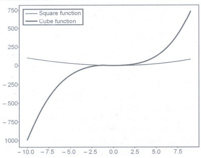
import
matplotlib.pyplot as plt
import
numpy as np
x =
np.linspace(-10, 9, 20)
y = x **
3
Z = x **
2
figure =
plt.figure()
axes =
figure.add_axes([0,0,1,1])
axes.plot(x,
z, label="Square Function")
axes.plot(x,
y, label="Cube Function")
axes.legend()
• In the
script above we define two functions: square and cube using x, y and z
variables. Next, we first plot the square function and for the label parameter,
we pass the value Square Function.
• This will
be the value displayed in the label for square function. Next, we plot the cube
function and pass Cube Function as value for the label parameter.
• The
output looks likes this:
Foundation of Data Science: Unit V: Data Visualization : Tag: : Data Visualization - Importing Matplotlib
Related Topics
Related Subjects

Foundation of Data Science
CS3352 3rd Semester CSE Dept | 2021 Regulation | 3rd Semester CSE Dept 2021 Regulation