Foundation of Data Science: Unit V: Data Visualization
Histogram
Matplotlib | Data Visualization
In a histogram, the data are grouped into ranges (e.g. 10 - 19, 20 - 29) and then plotted as connected bars.
Histogram
• In a
histogram, the data are grouped into ranges (e.g. 10 - 19, 20 - 29) and then
plotted as connected bars. Each bar represents a range of data. The width of
each bar is proportional to the width of each category, and the height is
proportional to the frequency or percentage of that category.
• It
provides a visual interpretation of numerical data by showing the number of
data points that fall within a specified range of values called
"bins".
• Fig.
5.5.1 shows histogram.
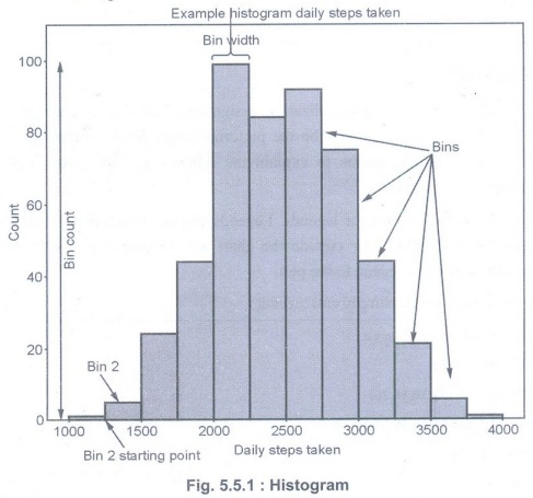
• Histograms
can display a large amount of data and the frequency of the data values. The median
and distribution of the data can be determined by a histogram. In addition, it
can show any outliers or gaps in the data.
• Matplotlib
provides a dedicated function to compute and display histograms: plt.hist()
• Code
for creating histogram with randomized data :
import
numpy as np
import
matplotlib.pyplot as plt
x = 40* np.random.randn(50000)
plt.hist(x,
20, range=(-50, 50), histtype='stepfilled',
align='mid',
color='r', label="Test Data')
plt.legend()
plt.title('
Histogram')
plt.show()
Foundation of Data Science: Unit V: Data Visualization : Tag: : Matplotlib | Data Visualization - Histogram
Related Topics
Related Subjects
Foundation of Data Science
CS3352 3rd Semester CSE Dept | 2021 Regulation | 3rd Semester CSE Dept 2021 Regulation