Foundation of Data Science: Unit II: Describing Data
Graphs for Quantitative Data
Describing Data | Data Science
A histogram is a special kind of bar graph that applies to quantitative data (discrete or continuous).
Graphs for
Quantitative Data
1. Histogram
• A
histogram is a special kind of bar graph that applies to quantitative data
(discrete or continuous). The horizontal axis represents the range of data
values. The bar height represents the frequency of data values falling within
the interval formed by the width of the bar. The bars are also pushed together
with no spaces between them.
• A
diagram consisting of rectangles whose area is proportional to the frequency of
a variable and whose width is equal to the class interval.
• Here
the data values only take on integer values, but we still split the range of
values into intervals. In this case, the intervals are [1,2), [2,3), [3,4),
etc. Notice that this graph is also close to being bell-shaped. A symmetric,
bell-shaped distribution is called a normal distribution.
• Fig.
2.4.1 shows histogram.
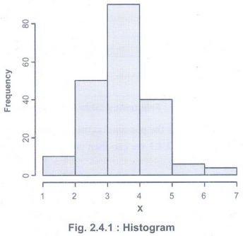
• Notice
that all the rectangles are adjacent and they have no gaps between them unlike
a bar graph.
• This
histogram above is called a frequency histogram. If we had used the relative
frequency to make the histogram, we would call the graph a relative frequency
histogram.
• If we
had used the percentage to make the histogram, we would call the graph a
percentage histogram.
• A
relative frequency histogram is the same as a regular histogram, except instead
of the bar height representing frequency, it now represents the relative
frequency (so the y-axis runs from 0 to 1, which is 0% to 100%).
2. Frequency polygon
•
Frequency polygons are a graphical device for understanding the shapes of
distributions. They serve the same purpose as histograms, but are especially
helpful for comparing sets of data. Frequency polygons are also a good choice
for displaying cumulative frequency distributions.
• We can
say that frequency polygon depicts the shapes and trends of data. It can be
drawn with or without a histogram.
•
Suppose we are given frequency and bins of the ages from another survey as
shown in Table 2.4.1.
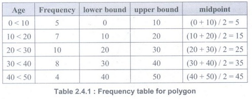
• The
midpoints will be used for the position on the horizontal axis and the
frequency for the vertical axis. From Table 2.4.1 we can then create the
frequency polygon as shown in Fig. 2.4.2.
• A line
indicates that there is a continuous movement. A frequency polygon should
therefore be used for scale variables that are binned, but sometimes a
frequency polygon is also used for ordinal variables.
•
Frequency polygons are useful for comparing distributions. This is achieved by
overlaying the frequency polygons drawn for different data sets.
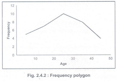
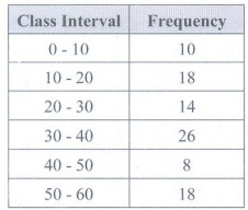
Example 2.4.1: The frequency polygon of a
frequency distribution is shown below.
Answer
the following about the distribution from the histogram.
(i) What
is the frequency of the class interval whose class mark is 15?
(ii)
What is the class interval whose class mark is 45?
(iii)
Construct a frequency table for the distribution.
• Solution:
(i)
Frequency of the class interval whose class mark is 15 → 8
(ii)
Class interval whose class mark is 45→40-50
(iii) As the class marks of consecutive
overlapping class intervals are 5, 15, 25, 35, 45, 55 we find the class
intervals are 0 - 10, 10-20, 20 - 30, 30 - 40, 40 - 50, 50 - 60. Therefore, the
frequency table is constructed as below.
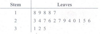
3. Steam and Leaf diagram:
• Stem
and leaf diagrams allow to display raw data visually. Each raw score is divided
into a stem and a leaf. The leaf is typically the last digit of the raw value.
The stem is the remaining digits of the raw value.
• Data
points are split into a leaf (usually the ones digit) and a stem (the other
digits)
• To
generate a stem and leaf diagram, first create a vertical column that contains
all of the stems. Then list each leaf next to the corresponding stem. In these
diagrams, all of the scores are represented in the diagram without the loss of
any information.
• A
stem-and-leaf plot retains the original data. The leaves are usually the last
digit in each data value and the stems are the remaining digits.
• Create
a stem-and-leaf plot of the following test scores from a group of college
freshmen.
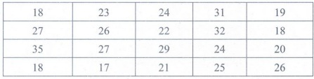
• Stem
and Leaf Diagram :
Foundation of Data Science: Unit II: Describing Data : Tag: : Describing Data | Data Science - Graphs for Quantitative Data
Related Topics
Related Subjects
Foundation of Data Science
CS3352 3rd Semester CSE Dept | 2021 Regulation | 3rd Semester CSE Dept 2021 Regulation