Foundation of Data Science: Unit I: Introduction
Exploratory Data Analysis
Data Science
Exploratory Data Analysis (EDA) is a general approach to exploring datasets by means of simple summary statistics and graphic visualizations in order to gain a deeper understanding of data.
Exploratory
Data Analysis
• Exploratory
Data Analysis (EDA) is a general approach to exploring datasets by means of
simple summary statistics and graphic visualizations in order to gain a deeper
understanding of data.
• EDA is
used by data scientists to analyze and investigate data sets and summarize
their main characteristics, often employing data visualization methods. It
helps determine how best to manipulate data sources to get the answers user
need, making it easier for data scientists to discover patterns, spot
anomalies, test a hypothesis or check assumptions.
• EDA is
an approach/philosophy for data analysis that employs a variety of techniques
to:
1. Maximize insight into a data set;
2. Uncover underlying structure;
3. Extract important variables;
4. Detect outliers and anomalies;
5. Test underlying assumptions;
6. Develop parsimonious models; and
7. Determine optimal factor settings.
• With
EDA, following functions are performed:
1. Describe of user data
2. Closely explore data distributions
3. Understand the relations between
variables
4. Notice unusual or unexpected situations
5. Place the data into groups
6. Notice unexpected patterns within groups
7. Take note of group differences
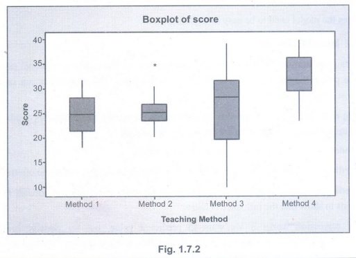
• Box
plots are an excellent tool for conveying location and variation information in
data sets, particularly for detecting and illustrating location and variation
changes between different groups of data.
• Exploratory
data analysis is majorly performed using the following methods:
1. Univariate analysis: Provides summary
statistics for each field in the raw data set (or) summary only on one variable.
Ex : CDF,PDF,Box plot
2. Bivariate analysis is performed to find
the relationship between each variable in the dataset and the target variable
of interest (or) using two variables and finding relationship between them. Ex:
Boxplot, Violin plot.
3. Multivariate analysis is performed to
understand interactions between different fields in the dataset (or) finding
interactions between variables more than 2.
• A box
plot is a type of chart often used in explanatory data analysis to visually
show the distribution of numerical data and skewness through displaying the
data quartiles or percentile and averages.
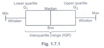
1.
Minimum score: The lowest score, exlcuding outliers.
2. Lower
quartile : 25% of scores fall below the lower quartile value.
3.
Median: The median marks the mid-point of the data and is shown by the line
that divides the box into two parts.
4. Upper
quartile : 75 % of the scores fall below the upper quartiel value.
5.
Maximum score: The highest score, excluding outliers.
6.
Whiskers: The upper and lower whiskers represent scores outside the middle 50%.
7. The
interquartile range: This is the box plot showing the middle 50% of scores.
•
Boxplots are also extremely usefule for visually checking group differences.
Suppose we have four groups of scores and we want to compare them by teaching
method. Teaching method is our categorical grouping variable and score is the
continuous outcomes variable that the researchers measured.
Foundation of Data Science: Unit I: Introduction : Tag: : Data Science - Exploratory Data Analysis
Related Topics
Related Subjects
Foundation of Data Science
CS3352 3rd Semester CSE Dept | 2021 Regulation | 3rd Semester CSE Dept 2021 Regulation