Foundation of Data Science: Unit V: Data Visualization
Density and Contour Plots
Matplotlib | Data Visualization
It is useful to display three-dimensional data in two dimensions using contours or color- coded regions.
Density and Contour Plots
• It is
useful to display three-dimensional data in two dimensions using contours or
color- coded regions. Three Matplotlib functions are used for this purpose.
They are :
a)
plt.contour for contour plots,
b)
plt.contourf for filled contour plots,
c)
plt.imshow for showing images.
1. Contour plot :
• A
contour line or isoline of a function of two variables is a curve along which
the function has a constant value. It is a cross-section of the
three-dimensional graph of the function f(x, y) parallel to the x, y plane.
•
Contour lines are used e.g. in geography and meteorology. In cartography, a
contour line joins points of equal height above a given level, such as mean sea
level.
• We can
also say in a more general way that a contour line of a function with two
variables is a curve which connects points with the same values.
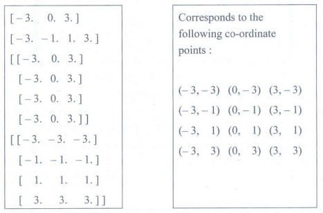
import
numpy as np
xlist =
np.linspace(-3.0, 3.0, 3)
ylist =
np.linspace(-3.0, 3.0, 4)
X, Y =
np.meshgrid(xlist, ylist
print(xlist)
print(ylist)
print(X)
print(Y)
Output:
Changing the colours and the line style
importmatplotlib.pyplot
as plt
plt.figure()
cp =
plt.contour(X, Y, Z, colors='black', linestyles='dashed')
plt.clabel(cp,
inline=True,
fontsize=10)
plt.title('Contour
Plot')
plt.xlabel('x
(cm))
plt.ylabel('y
(cm)')
plt.show()
Output:

• When
creating a contour plot, we can also specify the color map. There are different
classes of color maps. Matplotlib gives the following guidance :
a) Sequential: Change
in lightness and often saturation of color incrementally, often using a single
hue; should be used for representing information that has ordering.
b) Diverging: Change in lightness and
possibly saturation of two different colors that meet in the middle at an
unsaturated color; should be used when the information being plotted has a
critical middle value, such as topography or when the data deviates around zero.
c) Cyclic : Change in lightness of two
different colors that meet in the middle and beginning/end at an unsaturated
color; should be used for values that wrap around at the endpoints, such as
phase angle, wind direction, or time of day.
d) Qualitative: Often
are miscellaneous colors; should be used to represent information which does
not have ordering or relationships.
• This
data has both positive and negative values, which zero representing a node for
the wave function. There are three important display options for contour plots:
the undisplaced shape key, the scale factor, and the contour scale.
a) The
displaced shape option controls if and how the deformed model is shown in
comparison to the undeformed (original) geometry. The "Deformed shape
only" is the default and provides no basis for comparison.
b) The
"Deformed shape with undeformed edge" option overlays the contour
plot on an outline of the original model.
c) The
"Deformed shape with undeformed model" option overlays the contour
plot on the original finite element model.
Foundation of Data Science: Unit V: Data Visualization : Tag: : Matplotlib | Data Visualization - Density and Contour Plots
Related Topics
Related Subjects
Foundation of Data Science
CS3352 3rd Semester CSE Dept | 2021 Regulation | 3rd Semester CSE Dept 2021 Regulation