Foundation of Data Science: Unit V: Data Visualization
Customization
Matplotlib | Data Visualization
A tick is a short line on an axis. For category axes, ticks separate each category.
Customization
• A tick
is a short line on an axis. For category axes, ticks separate each category.
For value axes, ticks mark the major divisions and show the exact point on an
axis that the axis label defines. Ticks are always the same color and line
style as the axis.
• Ticks
are the markers denoting data points on axes. Matplotlib's default tick
locators and formatters are designed to be generally sufficient in many common
situations. Position and labels of ticks can be explicitly mentioned to suit
specific requirements.
• Fig.
5.9.1 shows ticks.
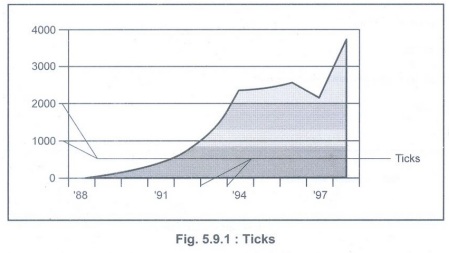
• Ticks
come in two types: major and minor.
a) Major
ticks separate the axis into major units. On category axes, major ticks are the
only ticks available. On value axes, one major tick appears for every major
axis division.
b) Minor
ticks subdivide the major tick units. They can only appear on value axes. One
minor tick appears for every minor axis division.
• By
default, major ticks appear for value axes. xticks is a method, which can be
used to get or to set the current tick locations and the labels.
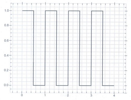
• The
following program creates a plot with both major and minor tick marks,
customized to be thicker and wider than the default, with the major tick marks
point into and out of the plot area.
importnumpyasnp
importmatplotlib.pyplotasplt
# A
selection of functions on rnabcissa points for 0 <= x < 1
rn=100
rx=np.linspace(0,1,rn,
endpoint=False)
deftophat(rx):
"""Top
hat function: y = 1 for x < 0.5, y=0 for x >= 0.5"""
ry=np.ones(rn)
ry[rx>=0.5]=0
returnry
# A
dictionary of functions to choose from
ry={half-sawtooth':lambdarx:rx.copy(),
'top-hat':tophat,
'sawtooth':lambdarx:2*np.abs(rx-0.5)}
# Repeat
the chosen function nrep times
nrep=4
x=np.linspace
(0,nrep,nrep*rn, endpoint=False)
y=np.tile(ry['top-hat']
(rx), nrep)
fig=plt.figure()
ax=fig.add_subplot(111)
ax.plot(x,y,'k',lw=2)
# Add a
bit of padding around the plotted line to aid visualization
ax.set_ylim(-0.1,1.1)
ax.set_xlim(x[0]-0.5,x[-1]+0.5)
#
Customize the tick marks and turn the grid on
ax.minorticks_on()
ax.tick_params
(which='major',length=10, width=2,direction='inout')
ax.tick_params(which='minor',length=5,width=2,
direction='in')
ax.grid(which='both')
plt.show()
Output:
Foundation of Data Science: Unit V: Data Visualization : Tag: : Matplotlib | Data Visualization - Customization
Related Topics
Related Subjects
Foundation of Data Science
CS3352 3rd Semester CSE Dept | 2021 Regulation | 3rd Semester CSE Dept 2021 Regulation