Foundation of Data Science: Unit I: Introduction
Basic Statistical Descriptions of Data
Data Science
For data preprocessing to be successful, it is essential to have an overall picture of our data.
Basic
Statistical Descriptions of Data
• For
data preprocessing to be successful, it is essential to have an overall picture
of our data. Basic statistical descriptions can be used to identify properties
of the data and highlight which data values should be treated as noise or
outliers.
• Basic
statistical descriptions can be used to identify properties of the data and
highlight which data values should be treated as noise or outliers.
• For
data preprocessing tasks, we want to learn about data characteristics regarding
both central tendency and dispersion of the data.
•
Measures of central tendency include mean, median, mode and midrange.
• Measures
of data dispersion include quartiles, interquartile range (IQR) and variance.
• These
descriptive statistics are of great help in understanding the distribution of
the data.
Measuring the Central Tendency
• We
look at various ways to measure the central tendency of data, include: Mean,
Weighted mean, Trimmed mean, Median, Mode and Midrange.
1. Mean :
• The
mean of a data set is the average of all the data values. The sample mean x is
the point estimator of the population mean μ.
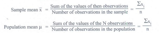
2. Median :
Sum of
the values of then observations Number of observations in the sample
Sum of
the values of the N observations Number of observations in the population
• The
median of a data set is the value in the middle when the data items are
arranged in ascending order. Whenever a data set has extreme values, the median
is the preferred measure of central location.
• The
median is the measure of location most often reported for annual income and
property value data. A few extremely large incomes of property values can
inflate the mean.
• For an
off number of observations:
7
observations= 26, 18, 27, 12, 14, 29, 19.
Numbers
in ascending order = 12, 14, 18, 19, 26, 27, 29
• The
median is the middle value.
Median=19
• For an
even number of observations :
8 observations = 26 18 29 12 14 27 30 19
Numbers
in ascending order =12, 14, 18, 19, 26, 27, 29, 30
The
median is the average of the middle two values.
3. Mode:
• The
mode of a data set is the value that occurs with greatest frequency. The
greatest frequency can occur at two or more different values. If the data have
exactly two modes, the data have exactly two modes, the data are bimodal. If
the data have more than two modes, the data are multimodal.
• Weighted mean:
Sometimes, each value in a set may be associated with a weight, the weights
reflect the significance, importance or occurrence frequency attached to their
respective values.
• Trimmed mean: A
major problem with the mean is its sensitivity to extreme (e.g., outlier)
values. Even a small number of extreme values can corrupt the mean. The trimmed
mean is the mean obtained after cutting off values at the high and low extremes.
• For
example, we can sort the values and remove the top and bottom 2 % before
computing the mean. We should avoid trimming too large a portion (such as 20 %)
at both ends as this can result in the loss of valuable information.
• Holistic measure is a measure that
must be computed on the entire data set as a whole. It cannot be computed by
partitioning the given data into subsets and merging the values obtained for
the measure in each subset.
Measuring the Dispersion of Data
• An outlier is an observation that lies an
abnormal distance from other values in a random sample from a population.
• First quartile (Q1): The first quartile is the value, where 25% of the
values are smaller than Q1 and 75% are larger.
• Third quartile (Q3): The
third quartile is the value, where 75 % of the values are smaller than Q3
and 25% are larger.
• The box plot is a useful graphical display
for describing the behavior of the data in the middle as well as at the ends of
the distributions. The box plot uses the median and the lower and upper quartiles.
If the lower quartile is Q1 and the upper quartile is Q3,
then the difference (Q3 - Q1) is called the interquartile
range or IQ.
• Range: Difference between highest
and lowest observed values
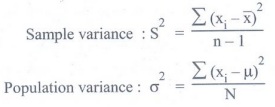
Variance :
• The
variance is a measure of variability that utilizes all the data. It is based on
the difference between the value of each observation (x;) and the mean (x) for
a sample, u for a population).
• The
variance is the average of the squared between each data value and the mean.
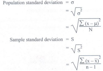
Standard Deviation :
• The
standard deviation of a data set is the positive square root of the variance.
It is measured in the same in the same units as the data, making it more easily
interpreted than the variance.
• The
standard deviation is computed as follows:
Difference between Standard Deviation and
Variance

Graphic Displays of Basic Statistical Descriptions
• There
are many types of graphs for the display of data summaries and distributions,
such as Bar charts, Pie charts, Line graphs, Boxplot, Histograms, Quantile
plots and Scatter plots.
1. Scatter diagram
• Also
called scatter plot, X-Y graph.
• While
working with statistical data it is often observed that there are connections
between sets of data. For example the mass and height of persons are related,
the taller the person the greater his/her mass.
• To
find out whether or not two sets of data are connected scatter diagrams can be
used. Scatter diagram shows the relationship between children's age and height.
• A
scatter diagram is a tool for analyzing relationship between two variables. One
variable is plotted on the horizontal axis and the other is plotted on the
vertical axis.
• The
pattern of their intersecting points can graphically show relationship
patterns. Commonly a scatter diagram is used to prove or disprove
cause-and-effect relationships.
• While
scatter diagram shows relationships, it does not by itself prove that one
variable causes other. In addition to showing possible cause and effect
relationships, a scatter diagram can show that two variables are from a common
cause that is unknown or that one variable can be used as a surrogate for the
other.
2. Histogram
• A
histogram is used to summarize discrete or continuous data. In a histogram, the
data are grouped into ranges (e.g. 10-19, 20-29) and then plotted as connected
bars. Each bar represents a range of data.
• To
construct a histogram from a continuous variable you first need to split the
data into intervals, called bins. Each bin contains the number of occurrences
of scores in the data set that are contained within that bin.
• The
width of each bar is proportional to the width of each category and the height
is proportional to the frequency or percentage of that category.
3. Line graphs
• It is
also called stick graphs. It gives relationships between variables.
• Line
graphs are usually used to show time series data that is how one or more
variables vary over a continuous period of time. They can also be used to compare
two different variables over time.
•
Typical examples of the types of data that can be presented using line graphs
are monthly rainfall and annual unemployment rates.
• Line
graphs are particularly useful for identifying patterns and trends in the data
such as seasonal effects, large changes and turning points. Fig. 1.12.1 show
line graph. (See Fig. 1.12.1 on next page)

• As
well as time series data, line graphs can also be appropriate for displaying
data that are measured over other continuous variables such as distance.
• For
example, a line graph could be used to show how pollution levels vary with
increasing distance from a source or how the level of a chemical varies with
depth of soil.
• In a
line graph the x-axis represents the continuous variable (for example year or
distance from the initial measurement) whilst the y-axis has a scale and
indicated the measurement.
•
Several data series can be plotted on the same line chart and this is
particularly useful for analysing and comparing the trends in different
datasets.
• Line
graph is often used to visualize rate of change of a quantity. It is more
useful when the given data has peaks and valleys. Line graphs are very simple
to draw and quite convenient to interpret.
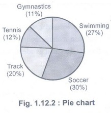
4. Pie charts
• A type
of graph is which a circle is divided into sectors that each represents a
proportion of whole. Each sector shows the relative size of each value.
• A pie
chart displays data, information and statistics in an easy to read "pie
slice" format with varying slice sizes telling how much of one data
element exists.
• Pie
chart is also known as circle graph. The bigger the slice, the more of that
particular data was gathered. The main use of a pie chart is to show
comparisons. Fig. 1.12.2 shows pie chart. (See Fig. 1.12.2 on next page)
• Various
applications of pie charts can be found in business, school and at home. For
business pie charts can be used to show the success or failure of certain
products or services.
• At
school, pie chart applications include showing how much time is allotted to
each subject. At home pie charts can be useful to see expenditure of monthly
income in different needs.
•
Reading of pie chart is as easy figuring out which slice of an actual pie is
the biggest.
Limitation
of pie chart:
• It is
difficult to tell the difference between estimates of similar size.
Error
bars or confidence limits cannot be shown on pie graph.
Legends
and labels on pie graphs are hard to align and read.
• The
human visual system is more efficient at perceiving and discriminating between
lines and line lengths rather than two-dimensional areas and angles.
• Pie
graphs simply don't work when comparing data.
Foundation of Data Science: Unit I: Introduction : Tag: : Data Science - Basic Statistical Descriptions of Data
Related Topics
Related Subjects
Foundation of Data Science
CS3352 3rd Semester CSE Dept | 2021 Regulation | 3rd Semester CSE Dept 2021 Regulation